Justine's Corner
Reworking on my site
Original idea
Recently, I decided to start writing more in a public space. I always had a blog, the one you are reading right now; but it was kinda left behind. As things are changing for me right now, I wanted to have a site I’d want to work on again.
As you may have guessed, this site is made with Hugo. I like Hugo since it is easy to use for someone like me and generates static files. I just need an nginx container and a few Gitea actions to keep things running. However, wanting a sense of accomplishment, I decided to write my own theme based on a color palette I like to use, which I named “Flowery”.
Things started by learning a bit more about design in general, and UX/UI especially. I watched more Juxtopposed videos than I’d like to admit, but the main one that motivated me was this one:
My goals were to have a site as readable and easy-to-use as possible, while evoking feelings of calm and intimacy. As it is a space of personal expression, I wanted to get away from the terminal or tech-y look that a lot of Hugo themes seem to follow.
Tools and steps followed
In the end, this video helped me decide that I would need to start with a visual draft, a wireframe version of the site. In the past, I often started with basic HTML and added CSS as I went, but this time I wanted a better aesthetic. The plan was: create a moodboard, then a simple mockup, then implement the CSS.
Here are the tools I used:
- Apple Freeform: I have recently started using MacOS, for the first time in my life. Coming from Linux, it is a weird OS to use; however, the tools Apple makes are quite nice. Freeform was used to create a moodboard, that I since lost unfortunately.
- Penpot: Not wanting to pay or give data to Figma, I looked into self-hosted alternatives and found Penpot. I installed my own instance and used it. I was pretty happy with the experience, even though I would have preferred to use a program on my computer rather than a web interface. Penpot was used to create a “wireframe” that later evolved into a mockup. I did not really follow it completely in the end, but it convinced me I liked the general idea.
- LMStudio and Gemma: I was pretty amazed to be able to run Gemma4 locally on my MacBook Air at a decent rate. Although I mainly used this when I had issues with CSS, every choice and every line in this website was made by my own hand.
- Zed editor: Zed is always my choice when I need to work on more than 2 files at the same time. Otherwise, I usually stick to Vim.
- The fonts used were found on Fontshare. I used “Kalam” for titles, since it looks handwritten and fits the aesthetic, and “Bespoke” for the rest of the text as it is easy to read.
- And of course, Hugo running in a VM on my Proxmox hypervisor.
Here is the mockup I made on Penpot: 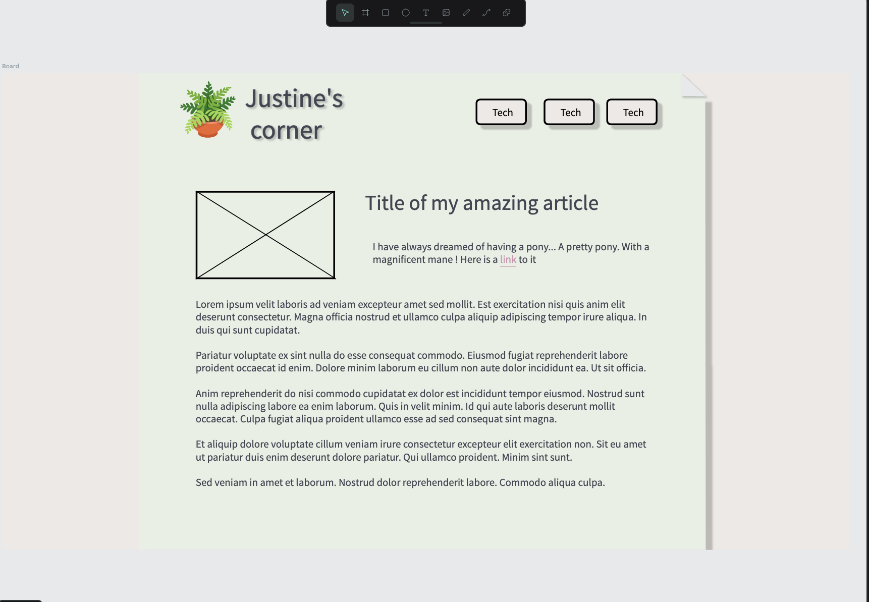
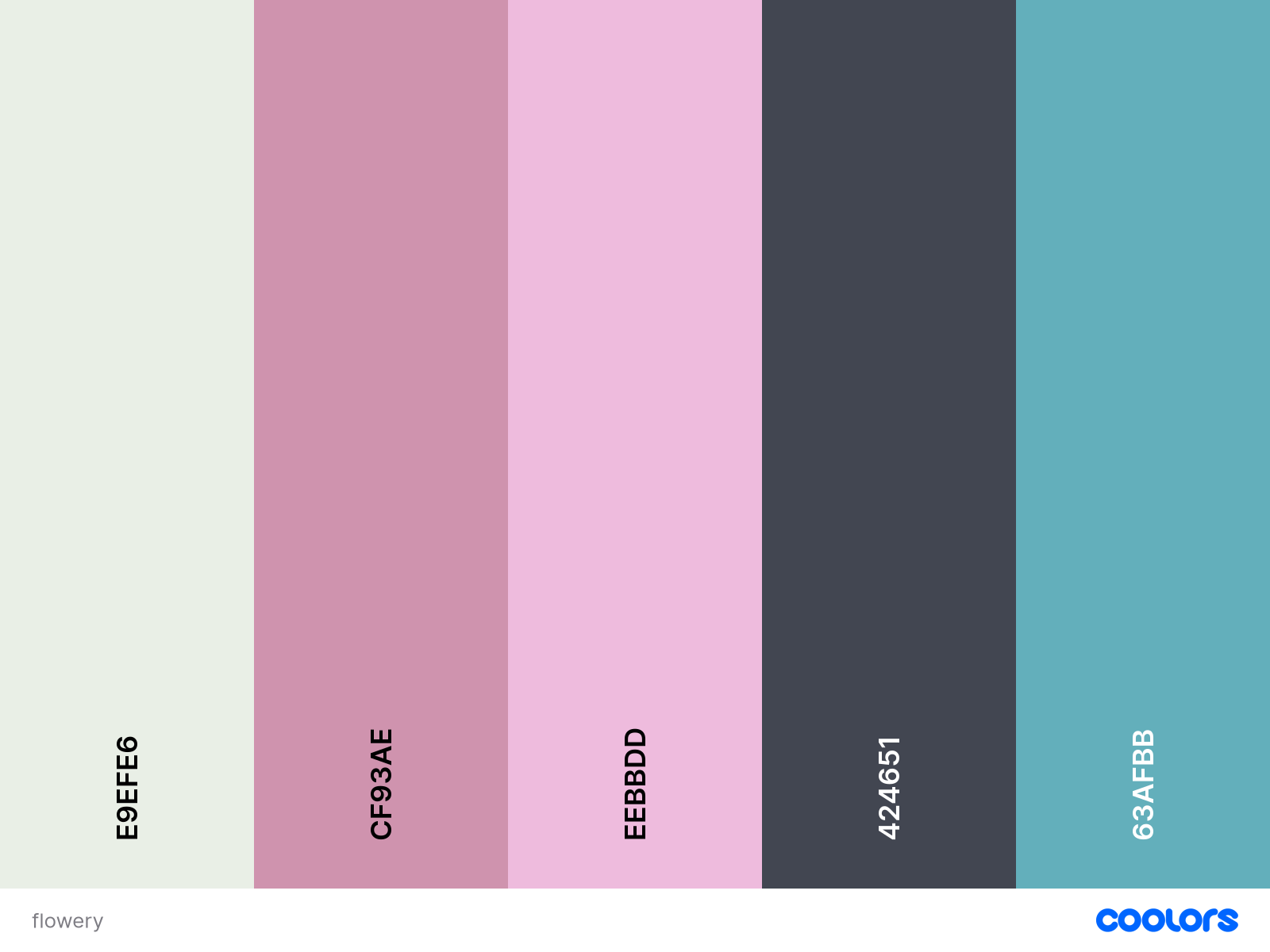
And here is the Flowery color palette:
Choices made, and what they mean
The goal of the Flowery color palette is, as the name suggests, to remind of a garden with flowers: a green background for grass and leaves, and pink accents for roses. My first attempt with this color palette was inspired by the sage green color of the iPhone 17; however, I went for something lighter to improve readability. Evoking vegetation is a way to express introspection and prudence. Plants are fragile things that need a lot of care and patience, and so are we as people. Writing has always been a way to grow and take care of myself, and using these images in creative endeavours is something that speaks to me.
As for the site itself, I wanted to keep things simple. This, in a way, is a diary, and diaries are supposed to only be seen and extended by their owners; no one writes comments in the margins. The choice of drop shadows and floating tabs was, as said, made to evoke paper; I wanted to get away from flat design as much as I could. Working as a systems administrator, I use a lot of ugly flat-design interfaces and have grown to despise them.
The “blushing” effect on the tabs was a bit of a happy accident. I really like it. After all, why wouldn’t a website be shy if it feels you touching its tabs?
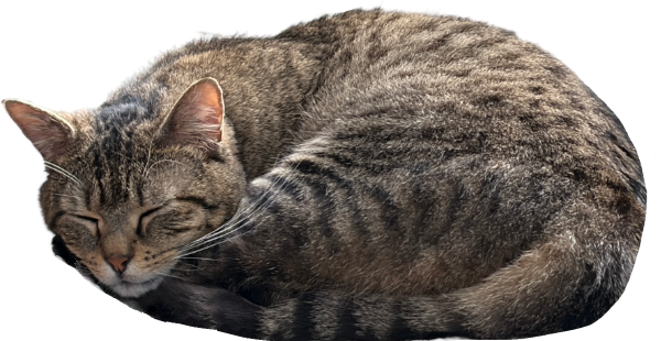
You can see the original mockup used an image of a fern. It was mainly a placeholder, but I knew the site needed some element that would give it personality. A mascot, you could say, that I found when I came upon a picture of Havelock, our cat, sleeping in his cat tree. Cats are always able to nap everywhere as if they owned the place, after all.
What next
I am always hesitant to share what I do. However, I might later share the theme with others if I manage to make it configurable enough. I don’t know who will read this blog, but I hope I can gather the courage to post my articles somewhere so I have opinions. You can always drop me a line if you come around here.